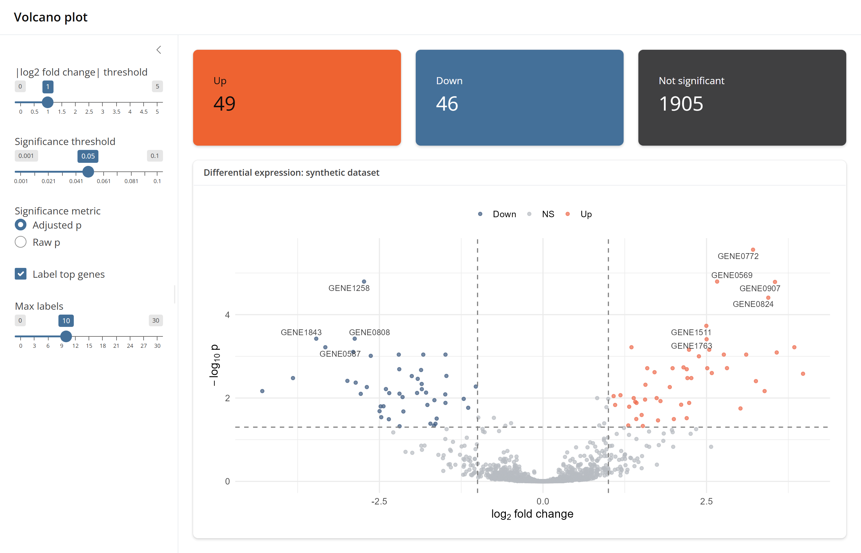
examples/volcano-plot is a small analysis app with the
usual bslib shape: controls in a sidebar, a row of value boxes, and a
plot in a card. It was ported from a plain bslib app, and the server
kept its shape. Only the layout moved to React.
Run it
The built client is committed, so the app runs without Node:
install.packages(c("pak", "shinyreact", "ggplot2", "ggrepel", "brand.yml"))
pak::pak("samuelbharti/bslibreact/pkg-r")
shiny::runApp("bslibreact/examples/volcano-plot")
Give the full path if R’s working directory is not the folder that holds the clone.
The page
src/App.tsx lays out the whole page. Each component
stands for one bslib call: PageSidebar for
page_sidebar(), LayoutColumns for
layout_columns(), ValueBox for
value_box(), Card for card().
<PageSidebar title="Volcano plot" sidebarWidth={290} sidebar={<Sidebar />}>
  <LayoutColumns colWidths={[4, 4, 4]} fill={false}>
    <ValueBox title="Up" theme="warning">
      <TextOutput id="n_up" className="value-box-value" />
    </ValueBox>
    <ValueBox title="Down" theme="primary">
      <TextOutput id="n_down" className="value-box-value" />
    </ValueBox>
    <ValueBox title="Not significant" theme="secondary">
      <TextOutput id="n_ns" className="value-box-value" />
    </ValueBox>
  </LayoutColumns>
  <Card fullScreen>
    <CardHeader>Differential expression: synthetic dataset</CardHeader>
    <CardBody>
      <Module namespace="volcano">
        <PlotOutput id="plot" height="560px" click="click" />
      </Module>
    </CardBody>
  </Card>
</PageSidebar>
Five hosted inputs
The sidebar holds two threshold sliders, a radio group, a checkbox
and a label count slider. The server renders each one with
host_input(), so they are Shiny’s own widgets:
bslibreact::host_input(
  output,
  "lfc",
  sliderInput("lfc", "|log2 fold change| threshold", min = 0, max = 5, value = 1, step = 0.1)
)
bslibreact::host_input(
  output,
  "pcol",
  radioButtons("pcol", "Significance metric", choices = c("Adjusted p" = "padj", "Raw p" = "pvalue"))
)
bslibreact::host_input(
  output,
  "dolabel",
  checkboxInput("dolabel", "Label top genes", value = TRUE)
)
The client mounts each one by its id plus _ui, with the
component that matches the widget:
function Sidebar() {
  return (
    <>
      <SliderInput id="lfc_ui" />
      <SliderInput id="p_ui" />
      <RadioButtons id="pcol_ui" />
      <CheckboxInput id="dolabel_ui" />
      <SliderInput id="topn_ui" />
    </>
  );
}
Waiting for the inputs
A hosted input has no value until the client has mounted it, so the
server waits for each one with req(). An unchecked box is
FALSE, which req() would also stop on, so the
checkbox is tested with is.null():
vol <- volcano_server(
  "volcano",
  de_results = reactive(de_results),
  lfc_threshold = reactive(req(input$lfc)),
  p_threshold = reactive(req(input$p)),
  p_col = reactive(req(input$pcol)),
  label_top_n = reactive({
    req(!is.null(input$dolabel), !is.null(input$topn))
    if (isTRUE(input$dolabel)) input$topn else 0L
  })
)
A plot inside a Shiny module
The plot is rendered by a real module,
moduleServer("volcano", ...), so its output id on the page
is volcano-plot. On the client,
<Module namespace="volcano"> adds the same prefix to
every id inside it.
<PlotOutput id="plot" click="click" /> therefore
displays volcano-plot and reports clicks as
volcano-click, and the module reads them as
input$click.
Value boxes that read text
The three counts are plain renderText() outputs:
counts <- reactive(volcano_status_counts(vol$data()))
output$n_up <- renderText(as.character(counts()[["Up"]]))
output$n_down <- renderText(as.character(counts()[["Down"]]))
output$n_ns <- renderText(as.character(counts()[["NS"]]))
Each one shows through a <TextOutput> inside a
<ValueBox>. The value box itself is React markup and
needs nothing from the server.
Colours and fonts from _brand.yml
The folder has a _brand.yml file.
bs_theme(version = 5, brand = TRUE) reads it, and
page_deps(app_theme) hands the page the themed CSS:
app_theme <- bs_theme(version = 5, brand = TRUE)

ui <- page_react(
  title = "Volcano plot",
  theme = app_theme,
  bslibreact::page_deps(app_theme)
)
The value boxes in the screenshot take their orange, blue and grey
from that file, through the warning, primary
and secondary themes. No colour is set in the client.
More
- Get started builds a smaller app step by step.
- Component gallery shows each component next to the bslib original.
- The example’s folder has the full source, including the Python server.