Creating Publication-Quality Graphics with ggplot2
Adapted from Software Carpentry
Overview
Today we will learn to:
- Use ggplot2 to generate publication-quality graphics
- Apply geometry, aesthetic, and statistics layers to a ggplot plot
- Manipulate aesthetics using different colors, shapes, and lines
- Improve data visualization through transforming scales and paneling by group
- Save a plot created with ggplot to disk
Questions
- How can I create publication-quality graphics in R?
Why ggplot2?
Plotting is one of the best ways to quickly explore data and relationships between variables.
Three main plotting systems in R:
- Base plotting system
- lattice package
- ggplot2 package (most effective for publication-quality graphics)
Grammar of Graphics
ggplot2 is built on the grammar of graphics. Any plot can be built from:
- Data sets - the data you provide
- Mapping aesthetics - how data connects to graphics (x, y, color, size)
- Layers - the actual graphical output (scatterplot, histogram, etc.)
Loading the Data
First, let’s load our packages and data:
library(ggplot2)

gapminder <- read.csv(
  "https://raw.githubusercontent.com/swcarpentry/r-novice-gapminder/main/episodes/data/gapminder_data.csv"
)
Starting with ggplot
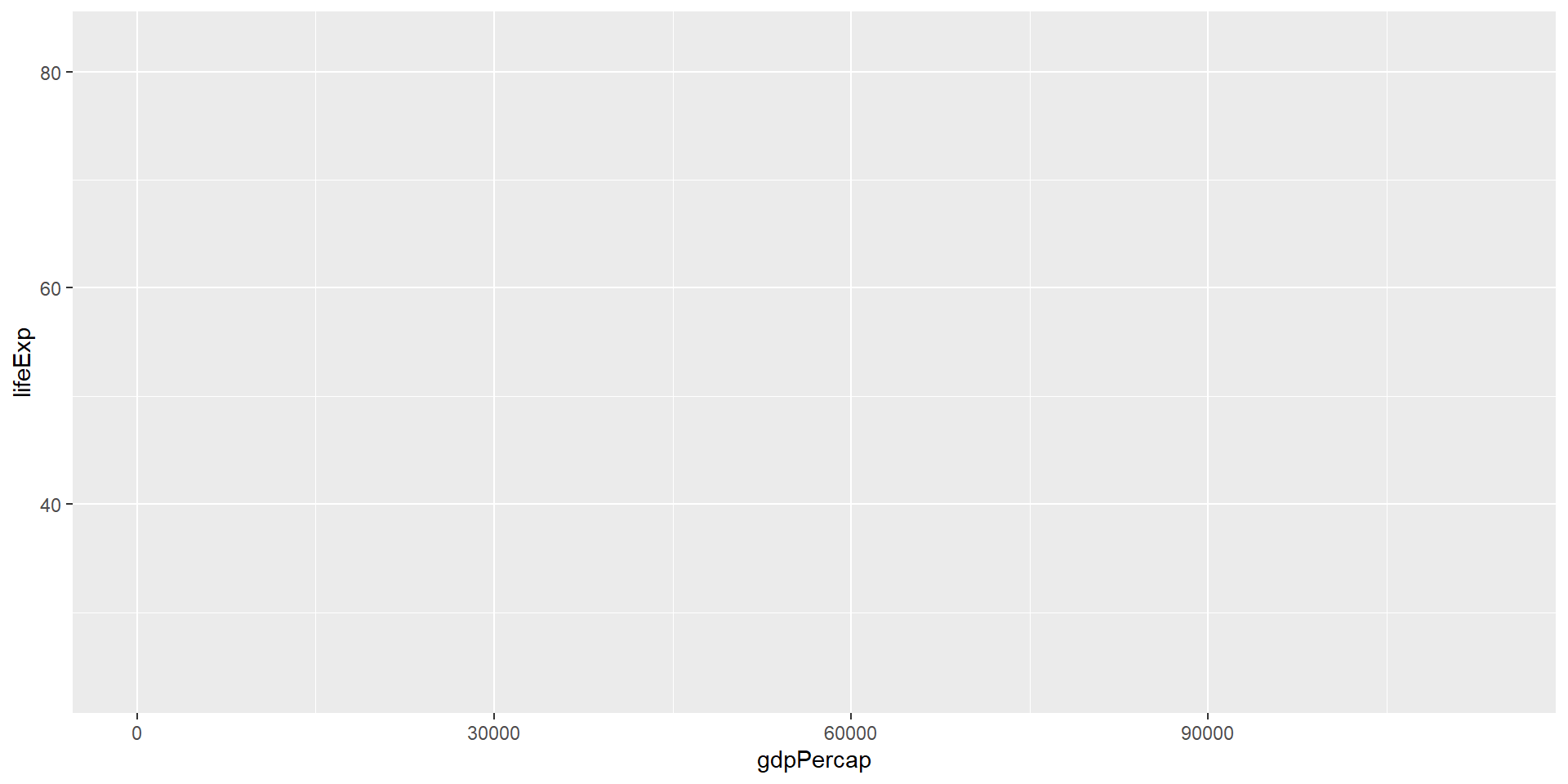
The most basic function is ggplot():
![]()
This creates a blank slate - we haven’t told it what to draw yet!
Adding Aesthetics
Use aes() to map variables to visual properties:
ggplot(data = gapminder, mapping = aes(x = gdpPercap, y = lifeExp))
![]()
Now we have axes, but still no data points!
Adding a Geom Layer
Tell ggplot how to represent the data visually:
ggplot(data = gapminder, mapping = aes(x = gdpPercap, y = lifeExp)) +
  geom_point()
![]()
geom_point() creates a scatterplot of points.
Challenge 1
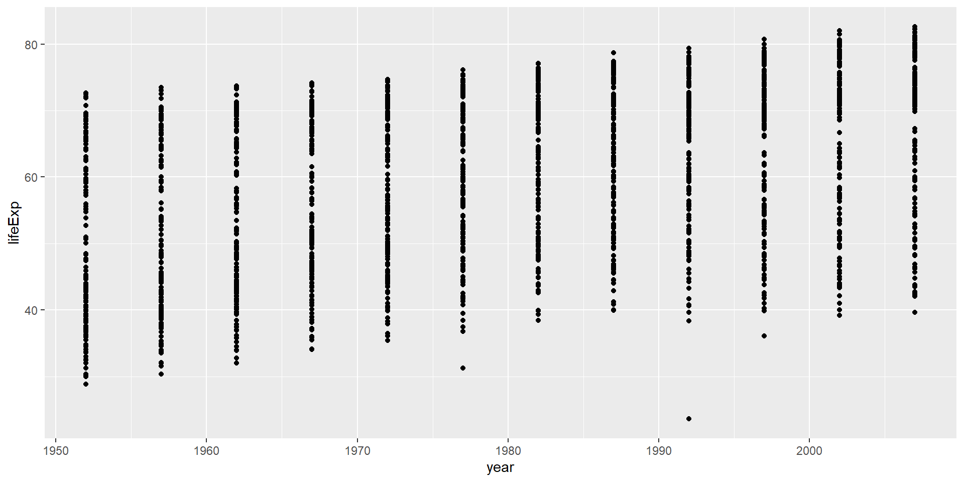
Modify the example so that the figure shows how life expectancy has changed over time:
ggplot(data = gapminder, mapping = aes(x = gdpPercap, y = lifeExp)) +
  geom_point()
Hint: the gapminder dataset has a column called “year”, which should appear on the x-axis.
Challenge 1 Solution
ggplot(data = gapminder, mapping = aes(x = year, y = lifeExp)) +
  geom_point()
![]()
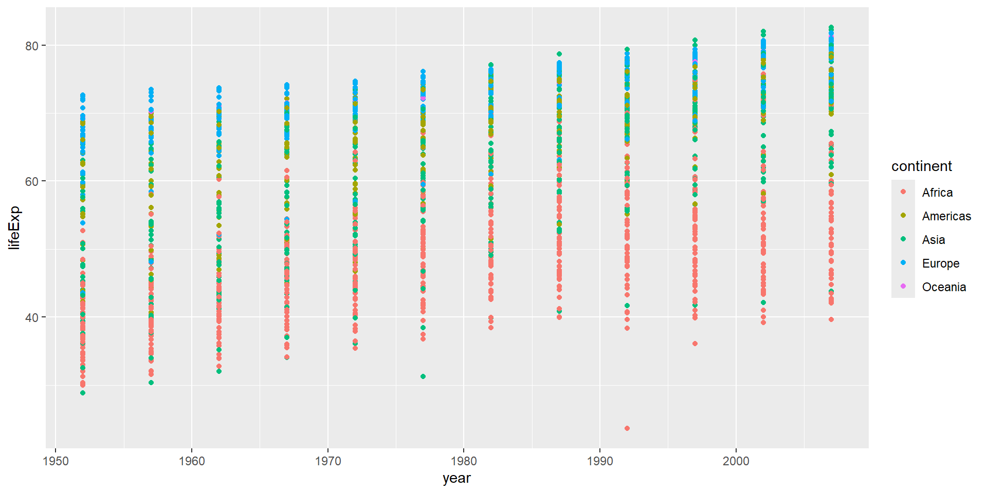
Challenge 2
Modify the code from Challenge 1 to color the points by the “continent” column.
What trends do you see in the data? Are they what you expected?
Challenge 2 Solution
ggplot(data = gapminder, mapping = aes(x = year, y = lifeExp, color = continent)) +
  geom_point()
![]()
The general trend shows increased life expectancy over the years. Continents with stronger economies show longer life expectancy.
Layers
Let’s visualize change over time with a line plot instead:
ggplot(data = gapminder, mapping = aes(x = year, y = lifeExp, color = continent)) +
  geom_line()
![]()
The result looks jumpy! Let’s separate by country.
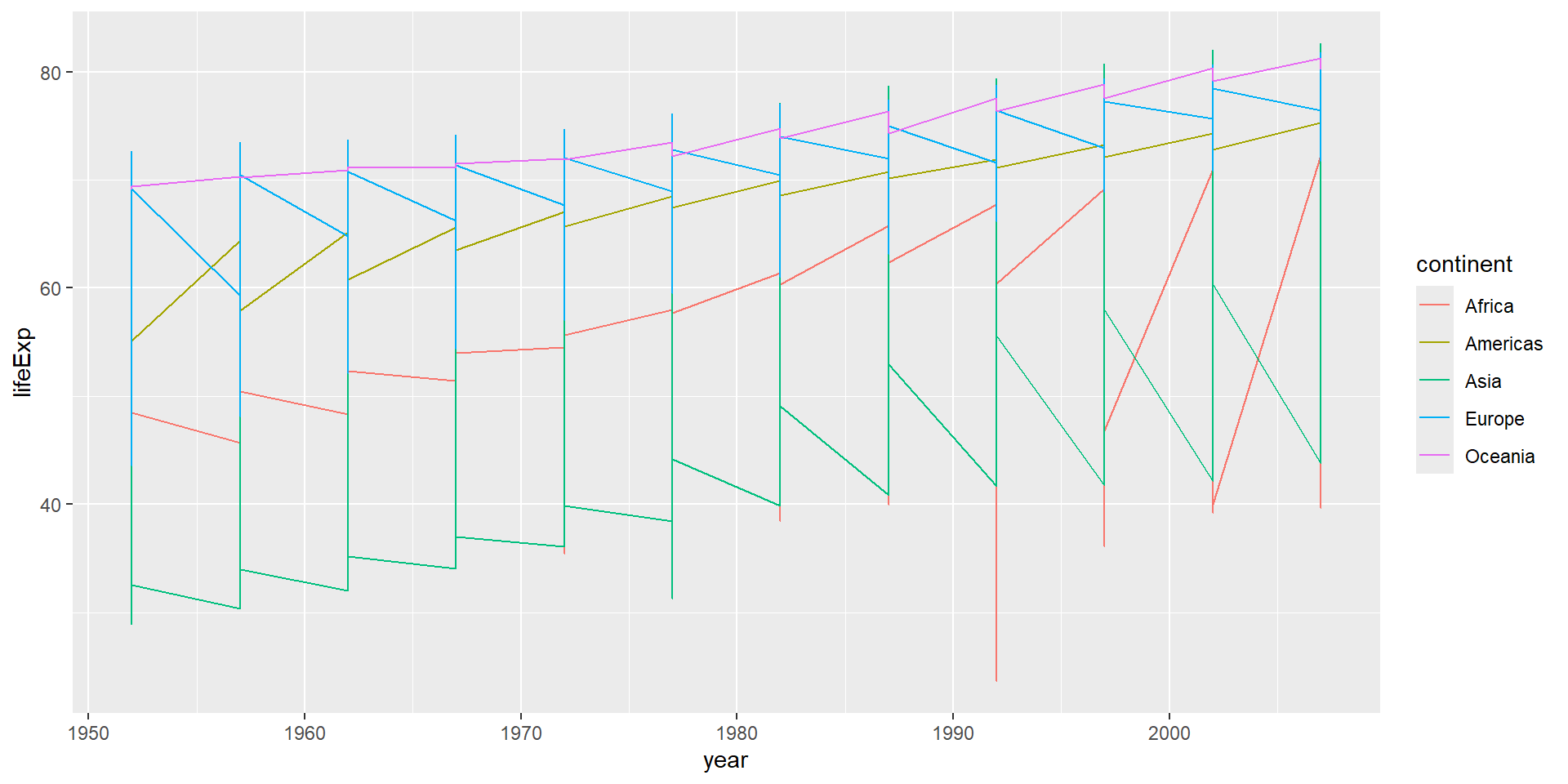
Grouping by Country
Use the group aesthetic to draw one line per country:
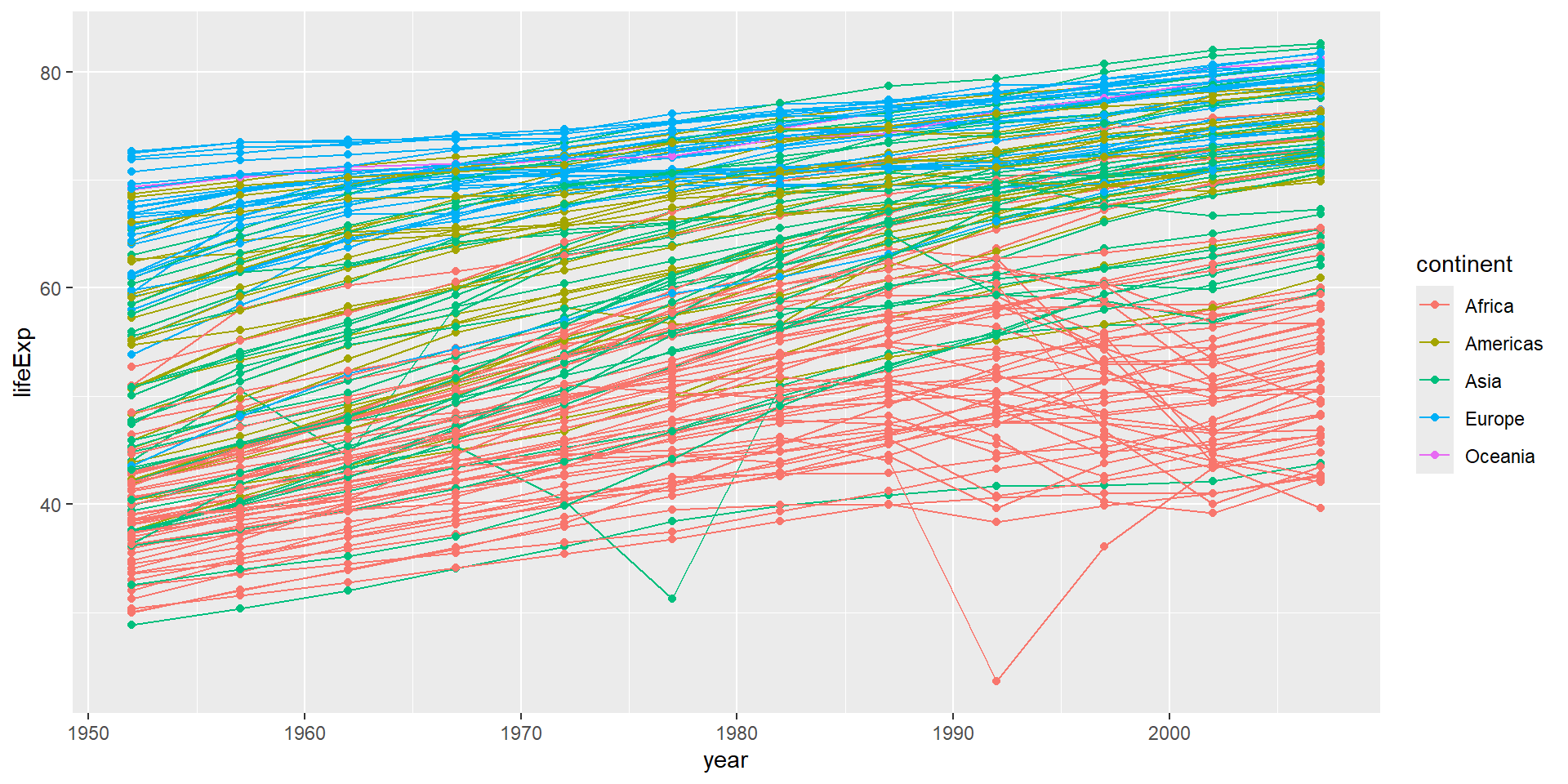
ggplot(data = gapminder, mapping = aes(x = year, y = lifeExp, group = country, color = continent)) +
  geom_line()
![]()
Now each country has its own line, colored by continent.
Combining Layers
Add multiple layers to show both lines and points:
ggplot(data = gapminder, mapping = aes(x = year, y = lifeExp, group = country, color = continent)) +
  geom_line() +
  geom_point()
![]()
Layer Order Matters
Each layer is drawn on top of the previous layer:
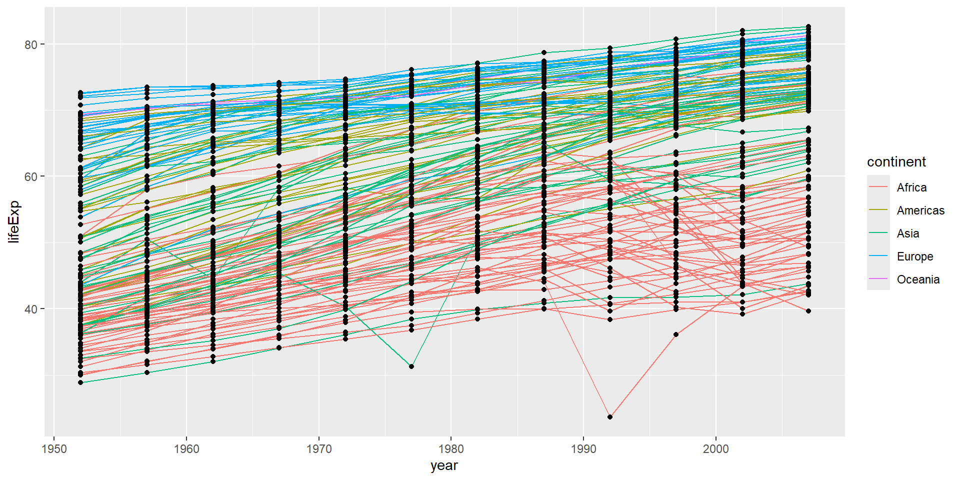
ggplot(data = gapminder, mapping = aes(x = year, y = lifeExp, group = country)) +
  geom_line(mapping = aes(color = continent)) +
  geom_point()
![]()
Here, color only applies to lines, and points are drawn on top.
Setting vs Mapping Aesthetics
Mapping: Use aes() to connect aesthetics to data variables
geom_line(mapping = aes(color = continent)) # Different color per continent
Setting: Put aesthetic outside aes() for a fixed value
geom_line(color = "blue") # All lines are blue
Challenge 3
Switch the order of the point and line layers from the previous example.
What happened?
Challenge 3 Solution
ggplot(data = gapminder, mapping = aes(x = year, y = lifeExp, group = country)) +
  geom_point() +
  geom_line(mapping = aes(color = continent))
![]()
The lines are now drawn over the points!
Alpha Transparency
The alpha setting (0 to 1) controls transparency:
alpha = 1 - fully opaque (default)alpha = 0.5 - 50% transparentalpha = 0 - fully transparent (invisible)
Useful for overlapping points!
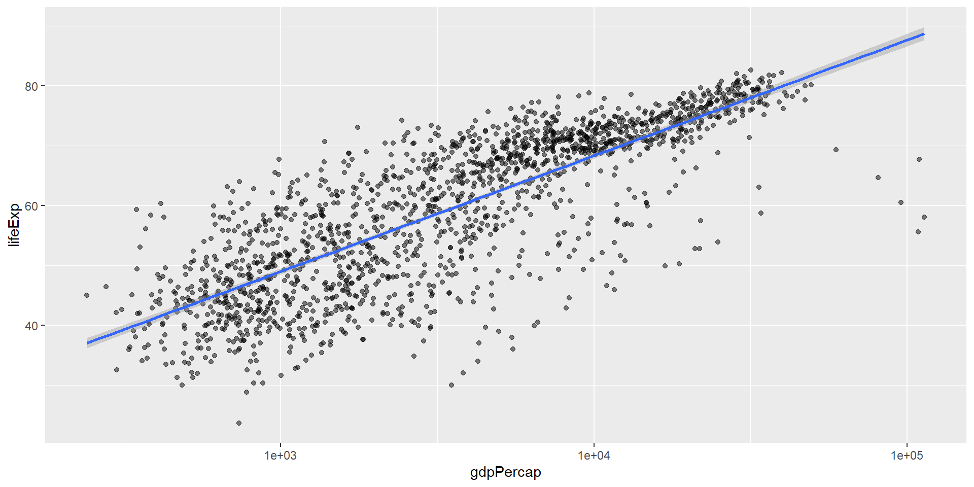
Adding a Trend Line
Use geom_smooth() to fit a statistical model:
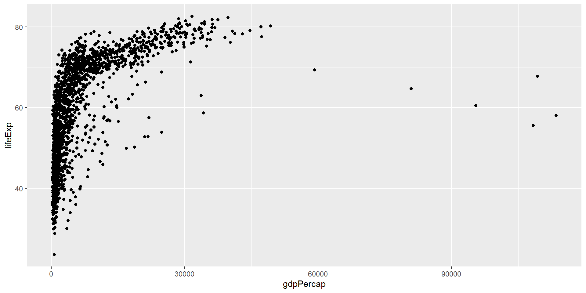
ggplot(data = gapminder, mapping = aes(x = gdpPercap, y = lifeExp)) +
  geom_point(alpha = 0.5) +
scale_x_log10() +
geom_smooth(method = "lm")
![]()
The gray shaded area shows 95% confidence intervals.
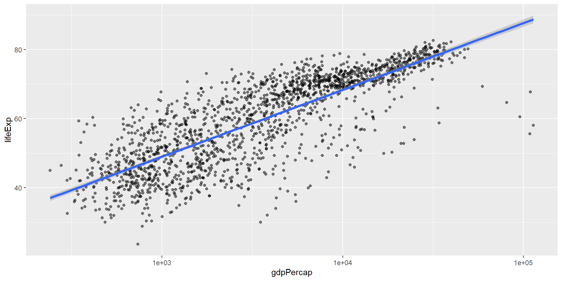
Customizing the Trend Line
Make the line thicker with linewidth:
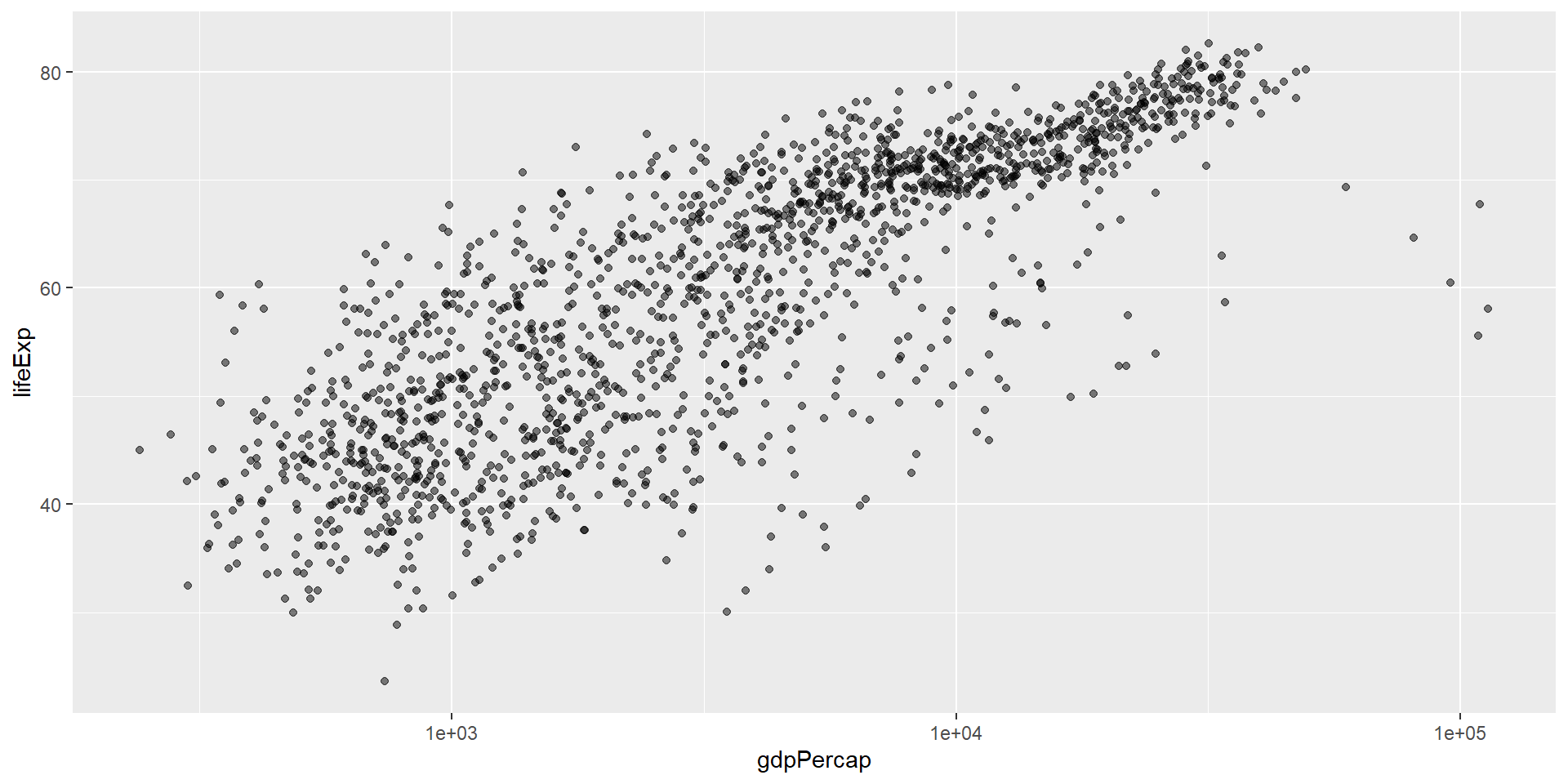
ggplot(data = gapminder, mapping = aes(x = gdpPercap, y = lifeExp)) +
  geom_point(alpha = 0.5) +
  scale_x_log10() +
  geom_smooth(method = "lm", linewidth = 1.5)
![]()
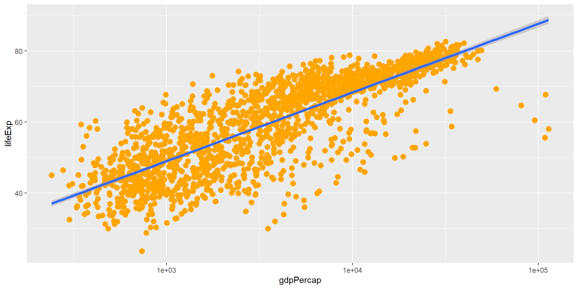
Challenge 4a
Modify the color and size of the points on the point layer in the previous example.
Hint: Do not use the aes() function.
Hint: The equivalent of linewidth for points is size.
Challenge 4a Solution
ggplot(data = gapminder, mapping = aes(x = gdpPercap, y = lifeExp)) +
  geom_point(size = 3, color = "orange") +
  scale_x_log10() +
  geom_smooth(method = "lm", linewidth = 1.5)
![]()
Color and size are set outside aes() so they apply to all points.
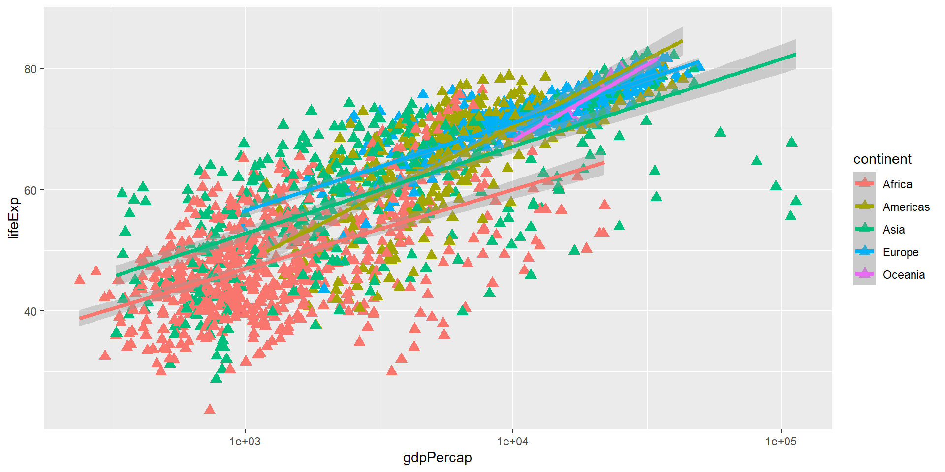
Challenge 4b
Modify your solution to Challenge 4a so that the points are now:
- A different shape
- Colored by continent
- With new trendlines for each continent
Hint: The color argument can be used inside the aesthetic.
Challenge 4b Solution
ggplot(data = gapminder, mapping = aes(x = gdpPercap, y = lifeExp, color = continent)) +
  geom_point(size = 3, shape = 17) +
  scale_x_log10() +
  geom_smooth(method = "lm", linewidth = 1.5)
![]()
shape is set for all points, while color is mapped to continent.
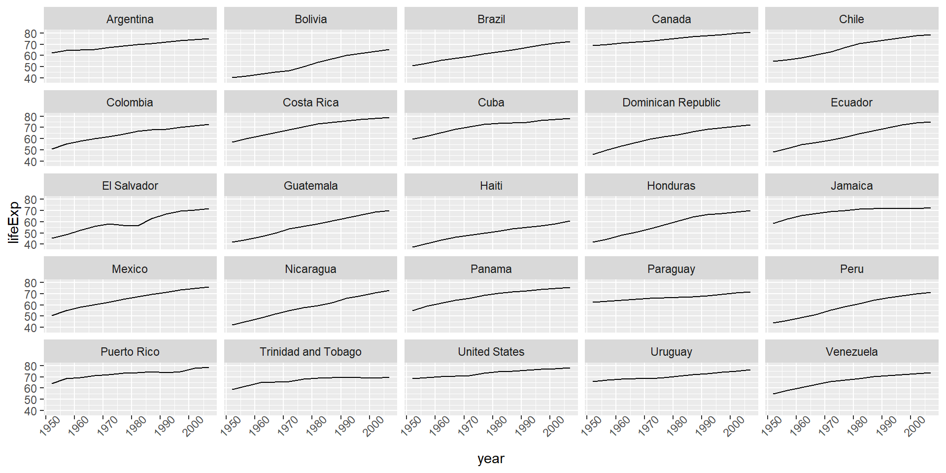
Understanding facet_wrap()
The formula ~ country tells R to:
- Draw a panel for each unique value in the country column
- The tilde (~) denotes a formula
Modifying Text
Clean up labels with labs() and theme():
ggplot(data = americas, mapping = aes(x = year, y = lifeExp, color = continent)) +
  geom_line() +
  facet_wrap(~ country) +
  labs(
    x = "Year",
    y = "Life expectancy",
    title = "Figure 1",
    color = "Continent"
  ) +
  theme(axis.text.x = element_text(angle = 90, hjust = 1))
![]()
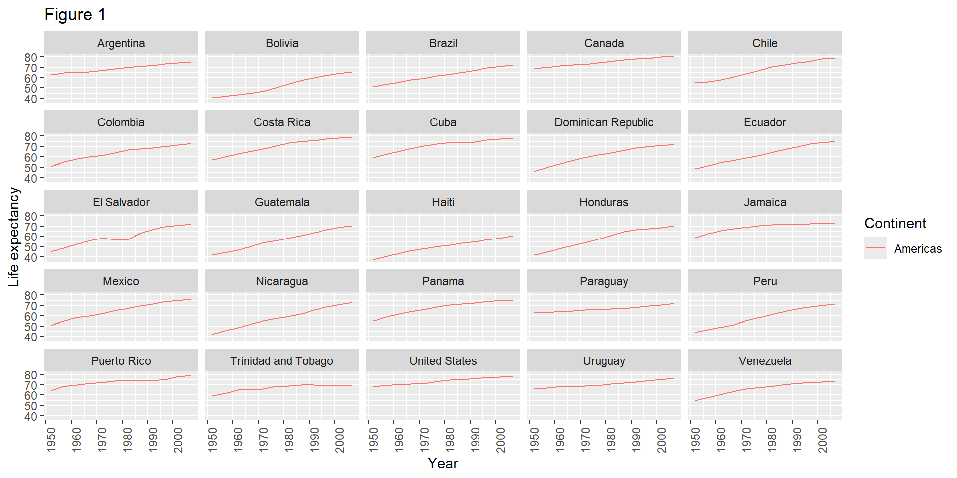
The labs() Function
labs() sets various text elements:
x - x-axis titley - y-axis titletitle - main plot titlecolor - legend title for color aestheticfill - legend title for fill aesthetic
Exporting Plots
Save plots with ggsave():
lifeExp_plot <- ggplot(data = americas, mapping = aes(x = year, y = lifeExp, color = continent)) +
  geom_line() +
  facet_wrap(~ country) +
  labs(
    x = "Year",
    y = "Life expectancy",
    title = "Figure 1",
    color = "Continent"
  ) +
  theme(axis.text.x = element_text(angle = 90, hjust = 1))

ggsave(filename = "results/lifeExp.png", plot = lifeExp_plot,
       width = 12, height = 10, dpi = 300, units = "cm")
ggsave() Features
Two nice things about ggsave():
Default to last plot: If you omit the plot argument, it saves the last plot you created
Auto-detect format: Determines format from file extension (.png, .pdf, etc.)
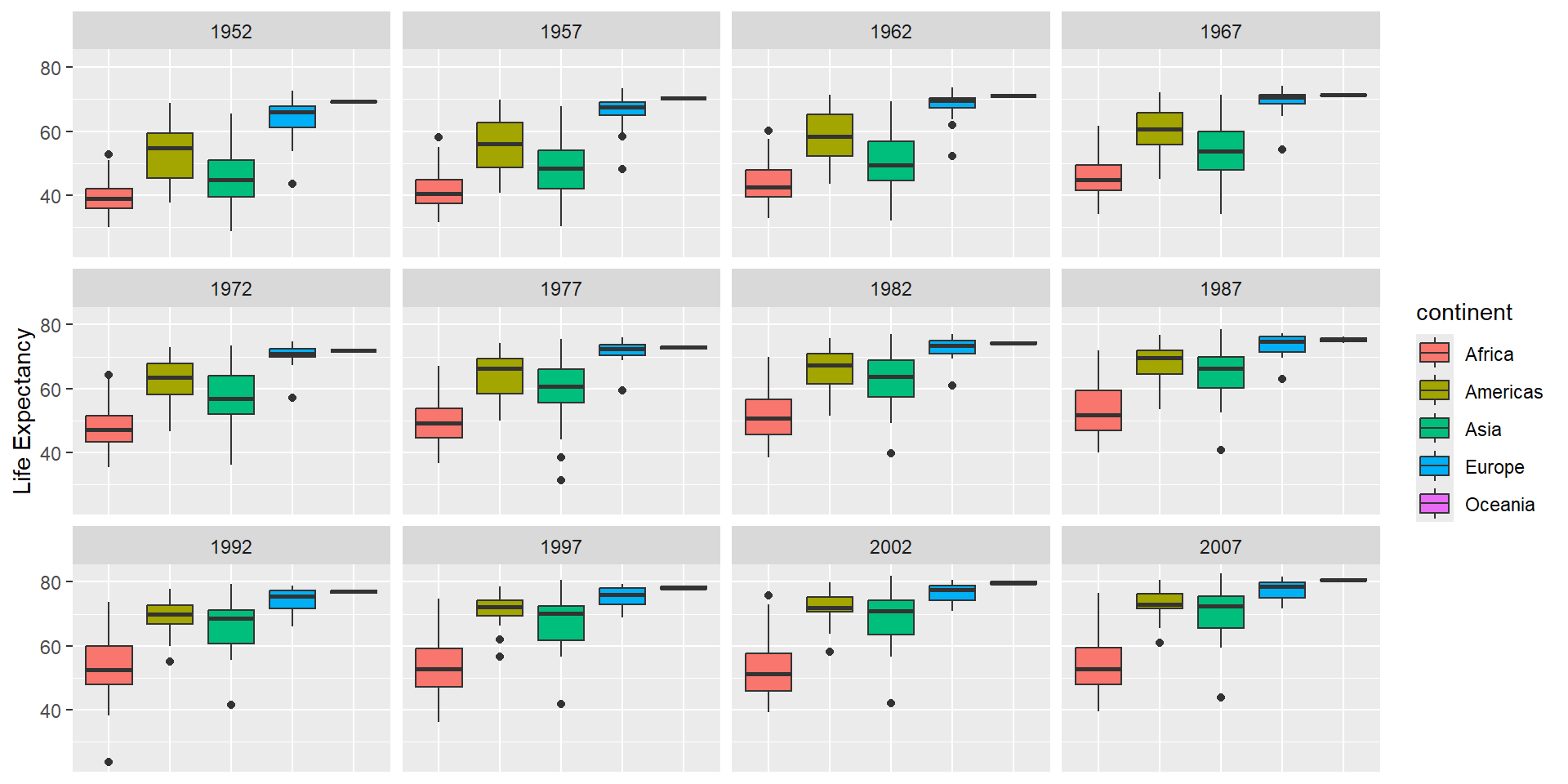
Challenge 5
Generate boxplots to compare life expectancy between the different continents during the available years.
Advanced:
- Rename y-axis as “Life Expectancy”
- Remove x-axis labels
Challenge 5 Solution
ggplot(data = gapminder, mapping = aes(x = continent, y = lifeExp, fill = continent)) +
  geom_boxplot() +
  facet_wrap(~ year) +
  ylab("Life Expectancy") +
  theme(
    axis.title.x = element_blank(),
    axis.text.x = element_blank(),
    axis.ticks.x = element_blank()
  )
![]()
Common Geoms
Here are some frequently used geom functions:
geom_point() |
Scatterplot |
geom_line() |
Line plot |
geom_boxplot() |
Box plot |
geom_histogram() |
Histogram |
geom_bar() |
Bar chart |
geom_smooth() |
Trend line |
Key Points
- Use
ggplot2 to create plots
- Think about graphics in layers: aesthetics, geometry, statistics, scale transformation, and grouping
- Use
aes() to map data to visual properties
- Add layers with
+ operator
- Customize with
labs() and theme()
- Save with
ggsave()
Important Reminders
- Each layer is drawn on top of previous layers
- Set aesthetics outside
aes() for fixed values
- Map aesthetics inside
aes() for data-dependent values
- Use
facet_wrap() for multi-panel figures
- Use
scale_* functions to transform axes